In the last few days I've spent a lot of time thinking on how the perfect GUI for Internet chess should be made.
I've taken inspiration from eboard, jin and most of all knights on how this could look.
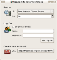
 First for the log on dialog, this is what I've come up with.
Good Points:
- I like the fact that you have easy access to creating new accounts.
Concerns:
- Users should probably not need to set the port, as it can be loaded from XML. The server "item" just looks so empty without it.
- There are no buttons in the lower right corner. The "Log On" button is in the middle..
- You have to open a website to create new accounts. Sadly, as far as I know, no servers offer a web service for this, which would make pychess able to have its own GUI for this.
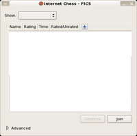
 Next for the actual game browsing dialog. This is a screenshot of the console hidden.
I'm not yet sure if this should be put inside a pychess game tab, like in knights and eboard, or it should be a window of its own, like the current "new game" dialog.
When you choose to join or observe a/some game(s) we will either replace the current tab (if we chose the tab way) or open a new tab. In both cases with a console sidepanel. This sidepanel can til we get gdl-dock implemented have a "show in window" button, for to view a full 80 column width console.
 On the right you see the fully expanded edition. In the eventual version, there will be more icons on the buttons.
Good Points:
- I'm very glad with the current simple look, that should make people able to join a game in one or two clicks.
- Power chess gamers still have full console access.
Concerns:
- Currently when you want to create/seek a new game with a special time setting, you choose -> Advanced -> Time -> Custom, which will bring up a dialog for you. This is perhaps a little to many clicks.
- The join button is not in the lower right corner..
No comments:
Post a Comment